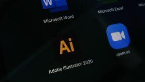
In the digital world of today, iconography has been used extensively in website and app designs. While there are some principles that icon design abides by, there are certain rules of its own. These are rules that can lead to successful designing of an icon for an app or a website. Let’s have a look at some of them:
1. Having a clear purpose for designing icons
There must be a clear purpose for designing an icon. You might think what kind of icons you need for your website or app. However, before this, you must be clear on why you need them. You wouldn’t need them just because you think they’re visually appealing.
Even the prettiest of icons get lost in this crowded digital world. The best way to begin is by considering navigation. Some of the social media websites and apps have simple, yet practical icons. This can be great for easy navigation. Additionally, including text along with the icons can be of immense help for users.
2. Understand your audience well
There are a few things you must consider before designing the icons. First is to never assume things. Next, be clear on who your users are. You might also want to consider why, how, where, and when they’ll be using your product or service. Taking the cultural norms into consideration is also important, especially if the design is targeting a specific country.
3. Do some careful planning
It requires a lot of attention to detail and careful planning to create and integrate icons. You’ll need to see where they would be used on the website or app. Next, you may have to understand how often will the icons be used. You might also want to see whether text needs to be used along with the icons.
4. Decide on the size of the icons
Another key rule for designing icons is to think about scalability and size. Most of the icons are created in the form of PNG files. Although they allow for pixel perfection, they don’t scale. Larger icons need deeper and richer designing while the smaller ones require less detail. There are two approaches when it comes to handling the size of the icon.
One is the top-down approach. It involves designing for the largest screen size in the most detail. Then it can be refined for the smaller sizes. Second approach is the mobile-first approach. In this approach, the smallest icon is designed first and then the details are added as you scale up.
5. Have an understanding of different formats
Being familiar with different formats and having the ability to assess their merits can be helpful when designing icons. Earlier the common image format was GIF, which would certainly have quality issues today. The PNG format can help in achieving higher quality, but they aren’t scalable. The ideal file format that’s universal and scalable is the SVG format.
6. Never manipulate icons of other brands
In this crowded digital world, it’s a common practice among designers to manipulate icons and logos of other brands. They mostly do it to meet their tight deadlines and ease their burden. This can lead to a lot of issues later on and must therefore be avoided.
7. Keep a good balance between form and function
When designing an icon, it is essential that the form and function be balanced. This is something that has been a topic of debate for years. Some prefer form over function while others have a liking for function. In reality, both are important from the perspective of designing icons for websites and apps.


